02 / 11
Ashlar
Ashlar is a boutique architecture studio based in Toronto, known for residential work that prioritises material authenticity and quiet craft. After a decade operating under a generic brand, they came to us wanting something that finally felt like the quality of their buildings.
The brief was direct: create a visual identity and website that could hold its own in the company of the studios they admired — and attract the kind of clients they were ready to work with.
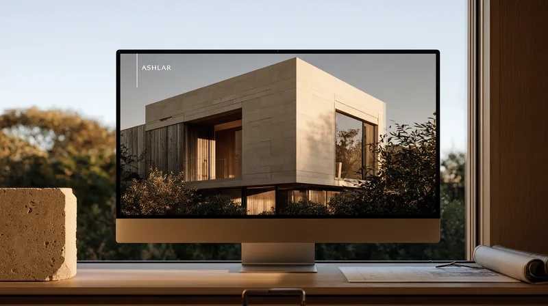
Portfolio layout — leading with full-bleed project photography
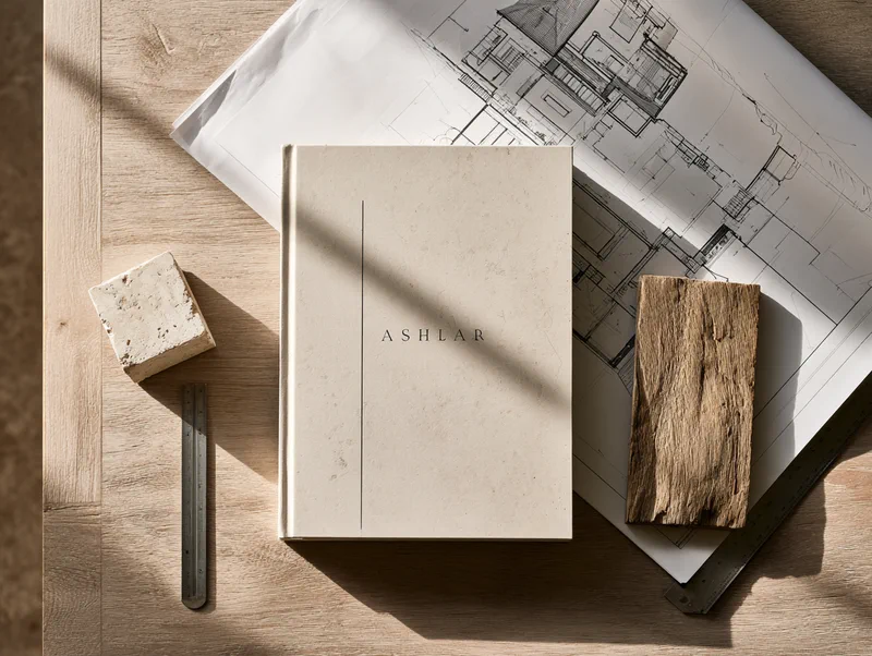
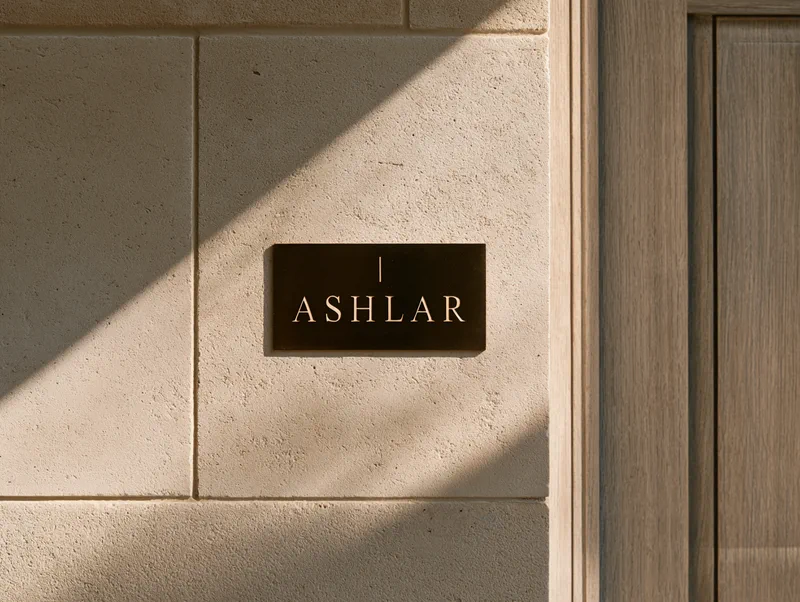
We started with the thing that makes Ashlar distinctive: they take time. The identity is built on restraint — a mark that functions as a logotype and a spatial device, type set in a high-contrast serif that references the technical drawings on their boards.
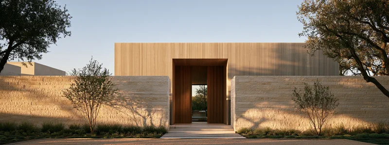
The website leads with full-bleed project photography and gets out of the way. Navigation is minimal. The work speaks. Photography direction focused on materials and light rather than occupied rooms — the approach Ashlar uses in their own practice applied to how the practice presents itself.
Ashlar launched the new identity alongside a portfolio of fourteen completed projects. Within three months, they had received enquiries from two commercial developers and a cultural institution — client types they hadn't previously attracted.
The identity system has since been extended to project documentation, construction drawing sets, and client proposals.
Selected work